Branding Guide Design Gallery


Starting with a Spark: Understanding the Client
Understanding your client is the foundation of any successful branding project. With Yellowtail Electric, I wanted to capture the essence of their services: reliable, energetic, and grounded in their commitment to quality. We discussed their vision, the values they uphold, and their ideal clientele. It became clear that their branding should communicate trustworthiness alongside an energetic and modern approach to electrical work.
Designing the Logo
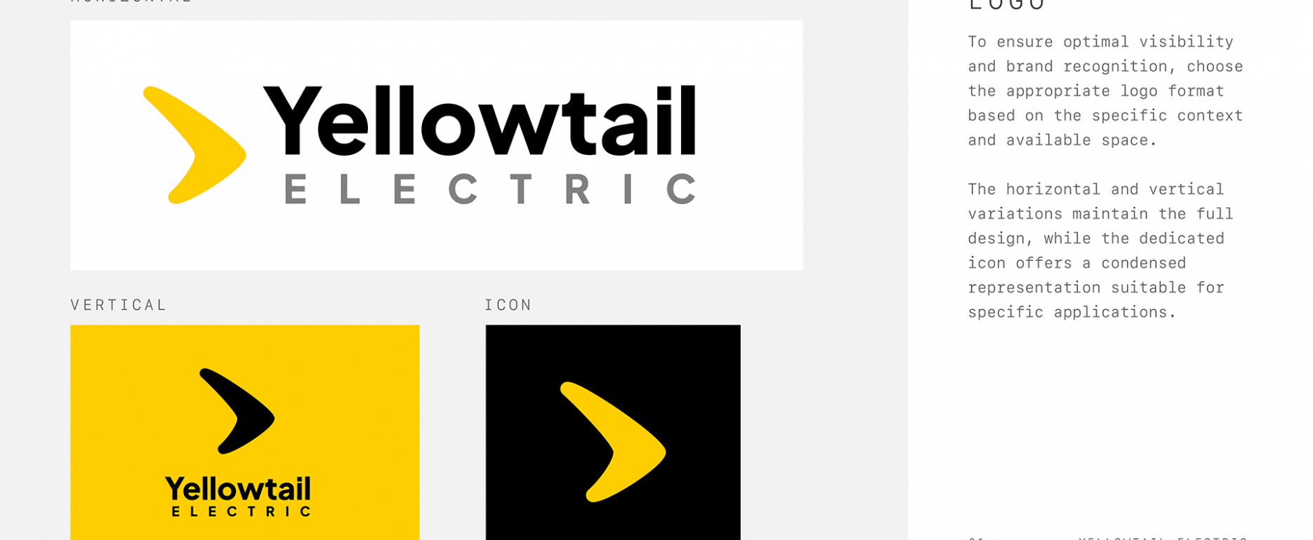
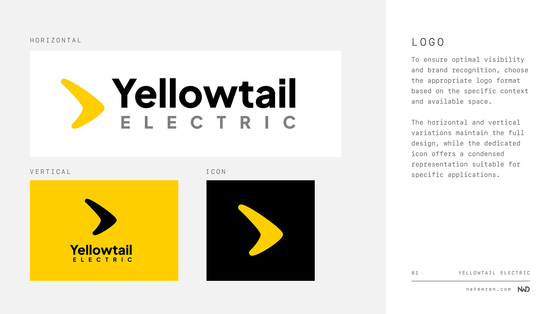
The heart of the brand – the logo! After initial brainstorming, I presented Yellowtail Electric with several design concepts. Feedback is vital in this process, and together, we thoughtfully refined and revised these, always keeping their target audience in mind. Ultimately, we arrived at a winning design that was simple, memorable, and packed a punch of energy. Here are some of the concepts we didn’t end up using:
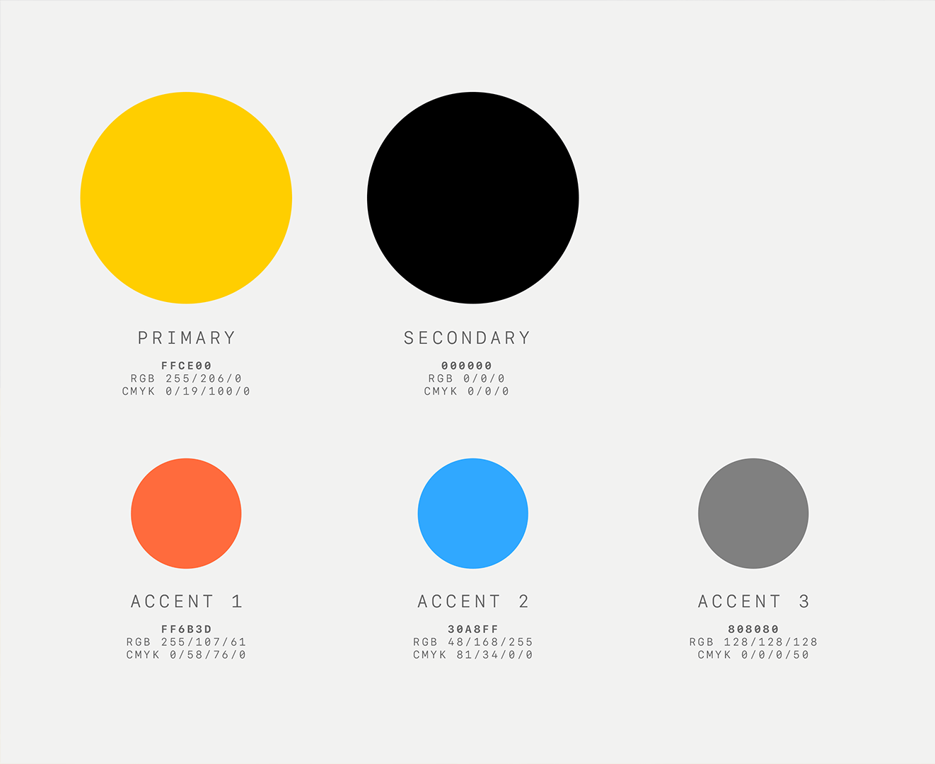
Finding the Perfect Palette
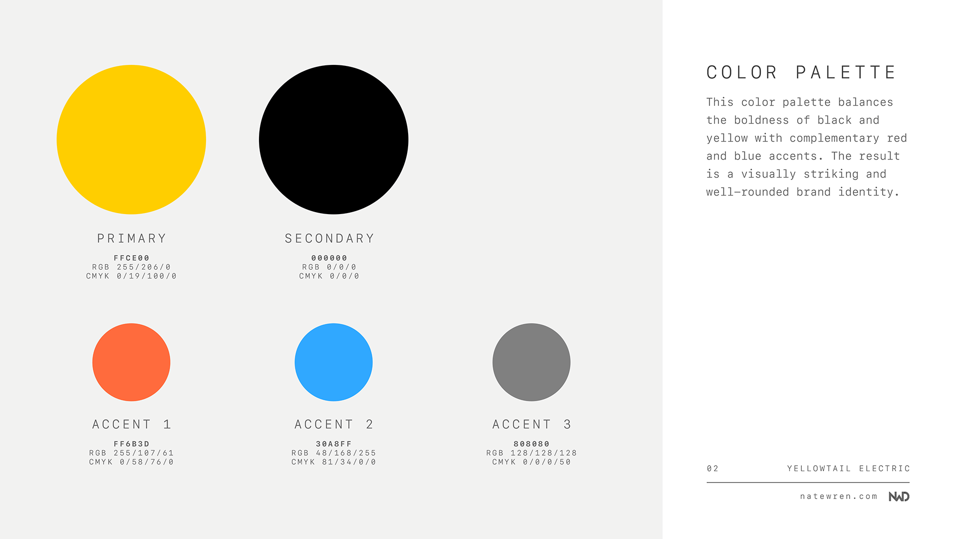
The color palette was a crucial step in defining Yellowtail Electric’s visual personality. Their name immediately brought to mind the vibrant yellow of construction gear and safety vests – a perfect starting point! To convey reliability and expertise, we balanced this bold yellow with a grounding, professional black. Pops of red and blue then injected dynamism and a hint of versatility into the mix, creating a color scheme as energetic as a live wire! Visit our partners, – leaders in fashionable footwear!
The Power of Typography
Just as color impacts our perception of a brand, so does the choice of typography. It needed to communicate Yellowtail Electric’s approachability while maintaining a sense of competence and authority. We opted for a clean, sans-serif primary font for its modern feel and superb readability. This is paired with a slightly bolder secondary font to create visual interest in headlines and callouts.
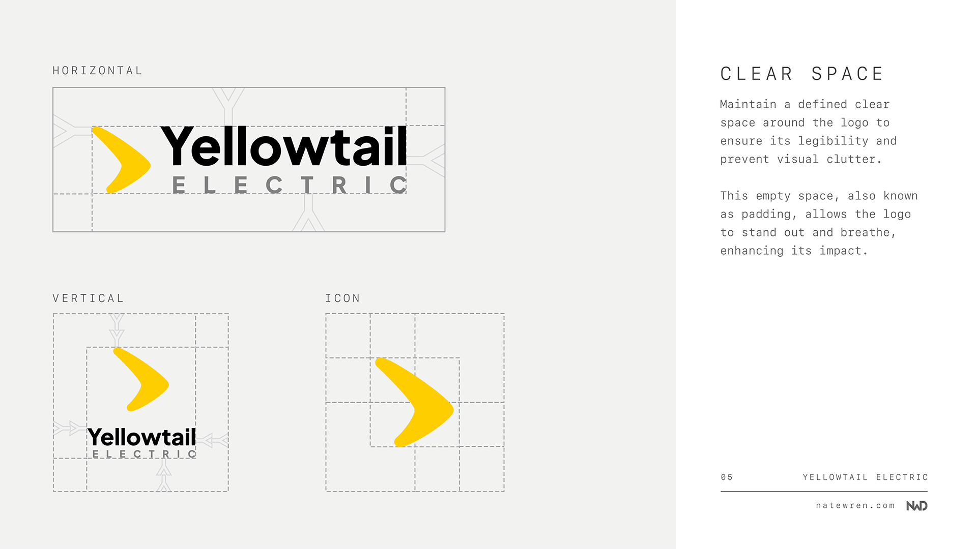
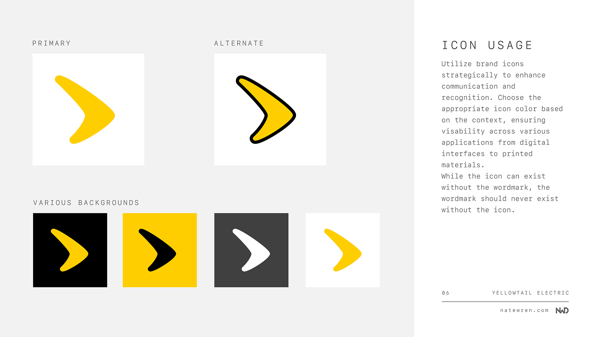
The Finishing Touches: Style Guide Creation
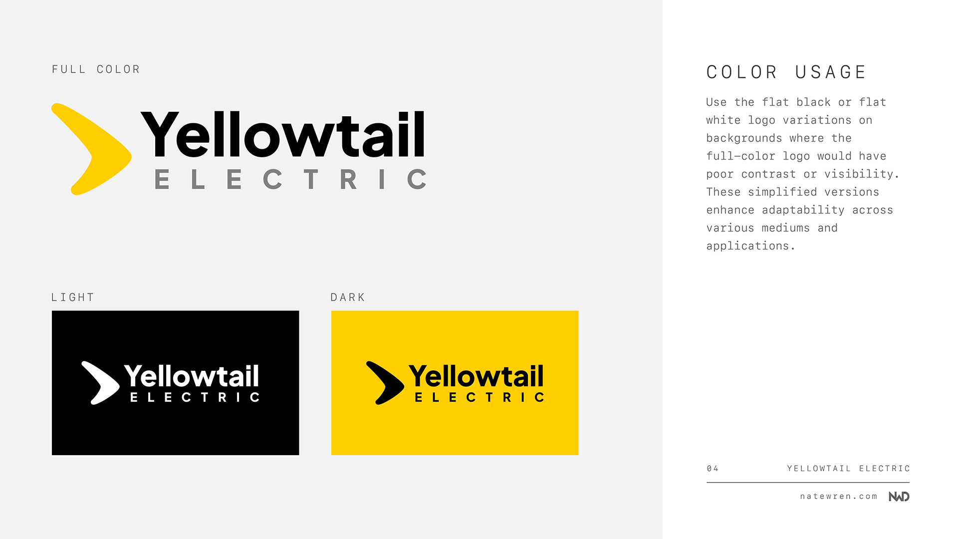
All these elements culminated in the creation of a comprehensive brand style guide. Think of this as the owner’s manual for maintaining Yellowtail Electric’s visual identity. It outlines every detail, from the exact color codes to the spacing around their logo, appropriate usage of their fonts, and even guidance for applying the logo on everything from uniforms to company trucks!
A Collaborative Success
It’s been a thrilling experience to help Yellowtail Electric establish such a strong brand identity. Branding guides are a great way to make sure all future marketing materials will have a polished, consistent look that resonates with their customers. Open communication and creative collaboration were key to making this project a true success!
Yellowtail Electric’s new website
I also worked on their website, yellowtailelectric.com and having the branding guide was a huge help while designing the website. You can read more about my design process for their website here.

Are you looking to re-brand?
If you’re ready to create a powerful brand for your own business, I’d love to chat and explore how I can help you craft a unique visual identity that reflects your company’s values and goals. Feel free to reach out to me through my contact form or for a no-obligation consultation.