Flight Icon Pack
The free and pro versions of Lines Icon Pack and Flight Icon pack are getting some pretty big updates this week. Both packs have been overhauled and improved in a few exciting ways. Here’s an in-depth look at the changes.
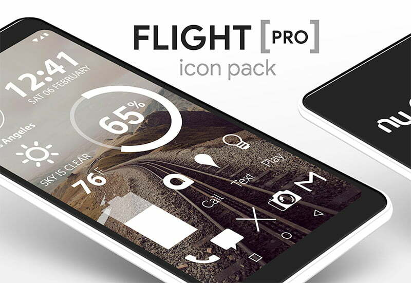


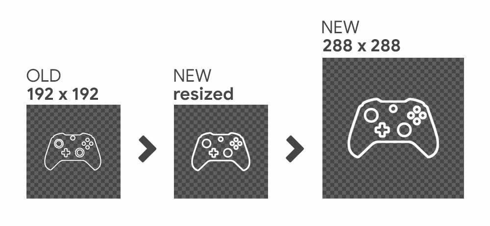
The overall icon size has been increased from 192×192 to 288×288. This means the icons will look better on high resolution devices and should provide you with more freedom when sizing them in your launcher settings.
Here’s a before and after:
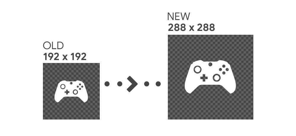
Notice the size has been increased and the empty space around the icon has been retained.
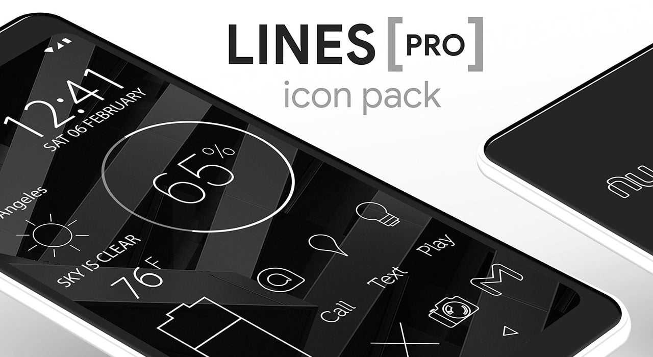
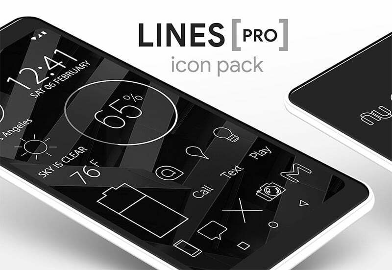
Lines Icon Pack
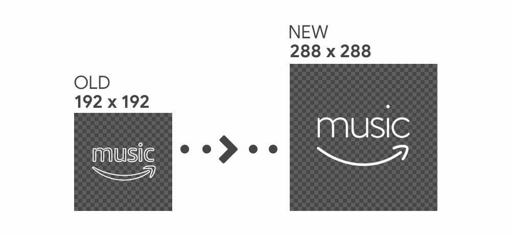
Lines icons have been completely overhauled. Not only are the icons larger, all of the icons have been recreated with a slightly thicker stroke width and many of the icons have been redesigned in order to keep them consistent with the simple line theme.


Here’s a before and after for Lines:
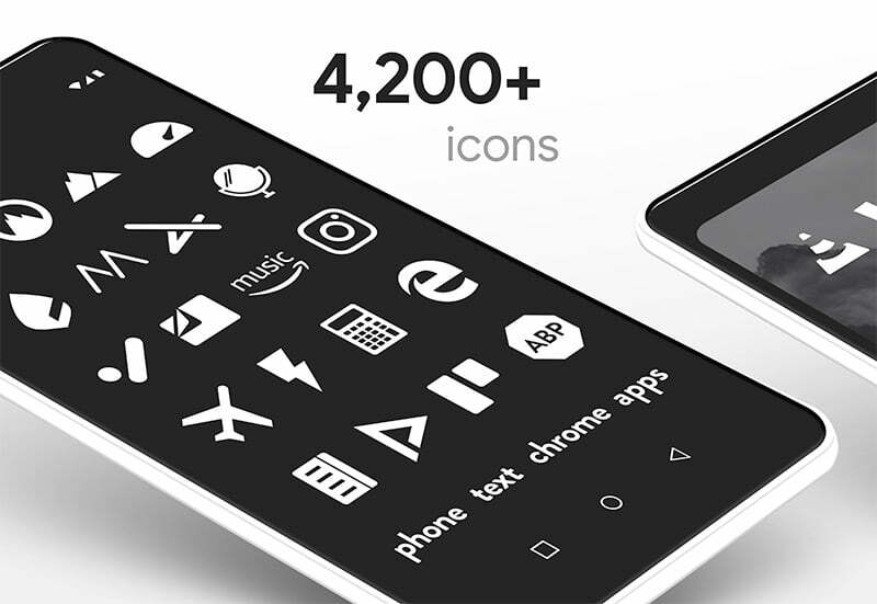
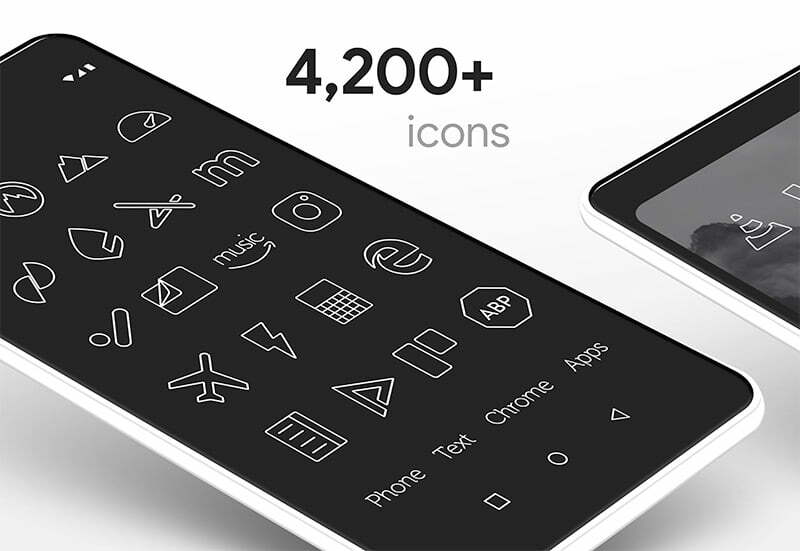
Many Lines icons have also been updated with custom fonts and new simpler shapes to follow a simpler single line design theme. Here’s an example using the Amazon Music app icon:

Feedback
Thanks for checking out the in-depth look at the update. These changes were not taken lightly and have been in development for quite a while. Many different test versions and revised tests were created before the new icons were made and I think these new icons increase the aesthetic appeal of the icon packs. However, that doesn’t mean these changes are set in stone! The opinion of you; the user, is what matters most. Please let me know what you think about the direction of the design in my contact form or via twitter. Love it? Hate it? I’m always open to feedback and would love to hear what you think!
-Nate