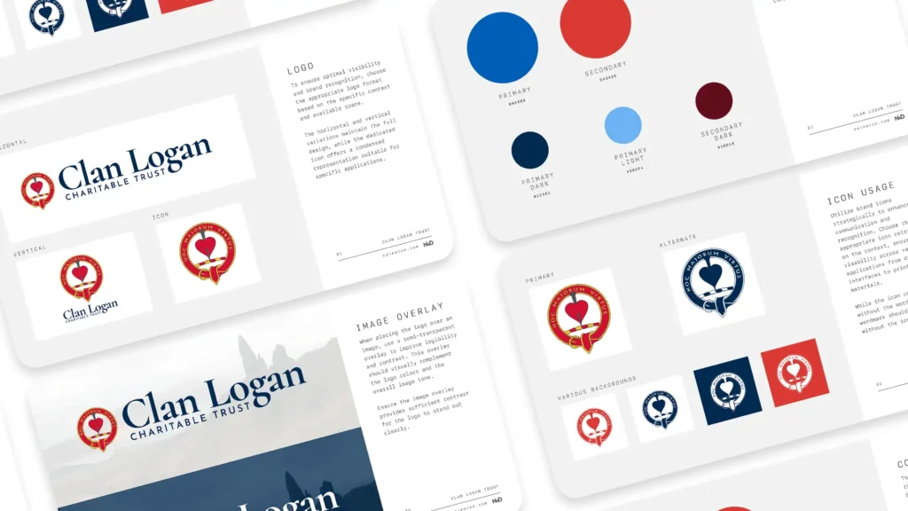
Branding Guide Gallery
The crest and the motto
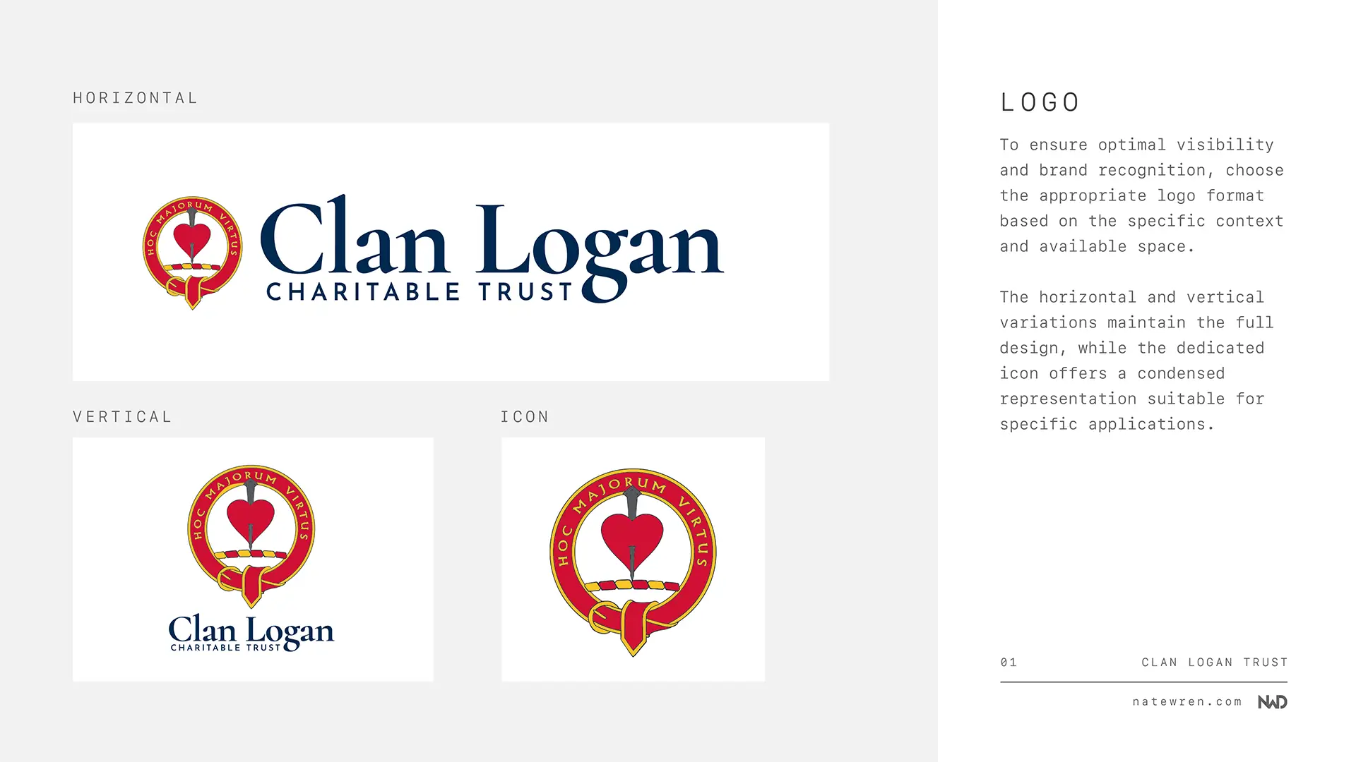
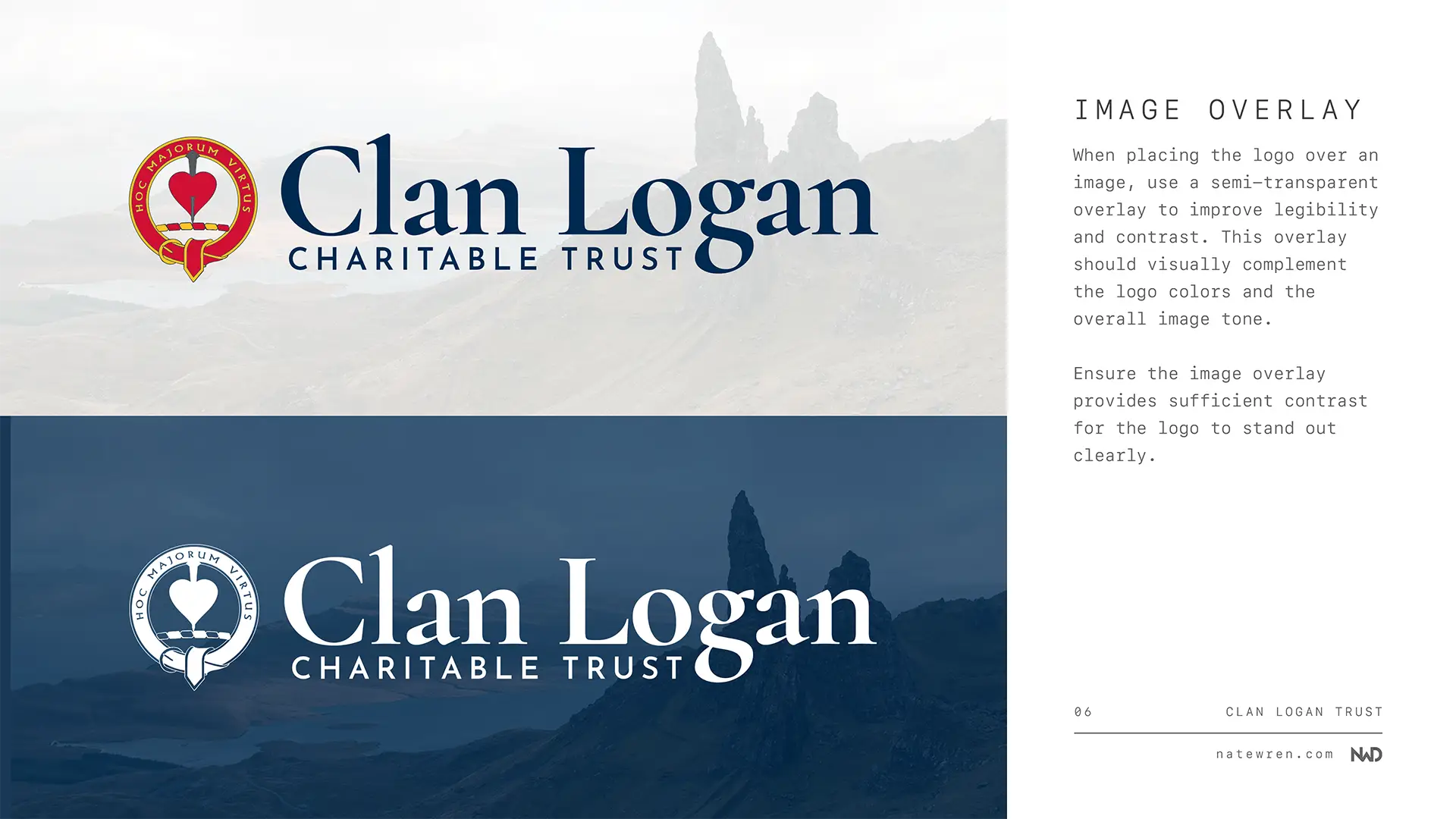
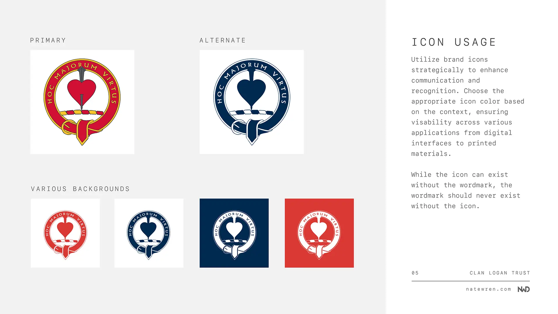
The trust already had a Logan clan badge and were clear they wanted to keep it, which is the right instinct. A clan crest is not a logo you redesign on a whim. It carries real meaning to the people who use it.
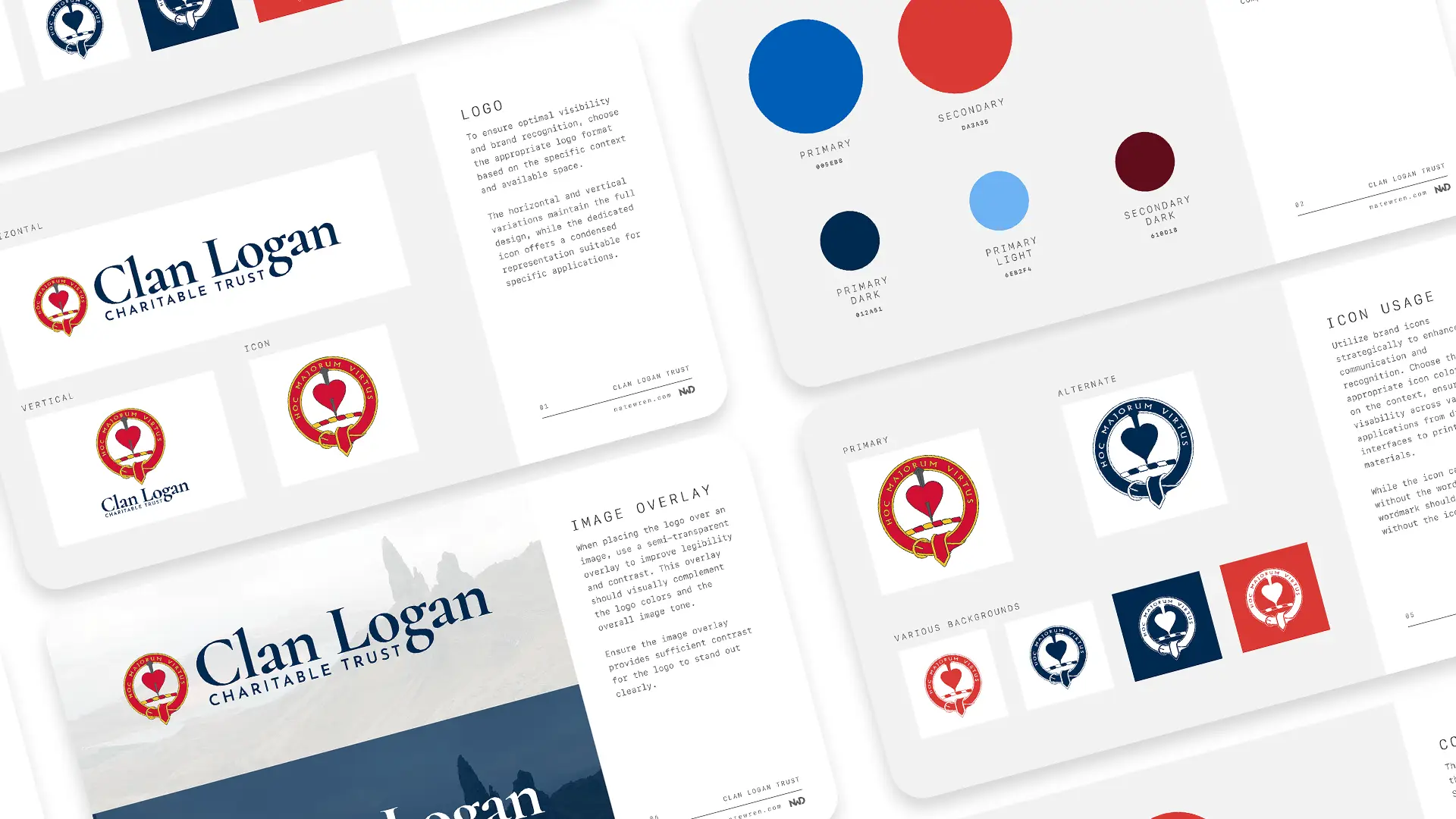
So I redrew it clean, wrapped it with the clan motto MAJORUM VIRTUTUM MEMOR, which means “mindful of the virtues of our ancestors”, and built out horizontal, vertical, and icon only versions. The same mark now works in a wide site header, a stacked footer, a printed letterhead, and a 32 pixel favicon without any of them looking like a compromise.
A palette from the Saltire
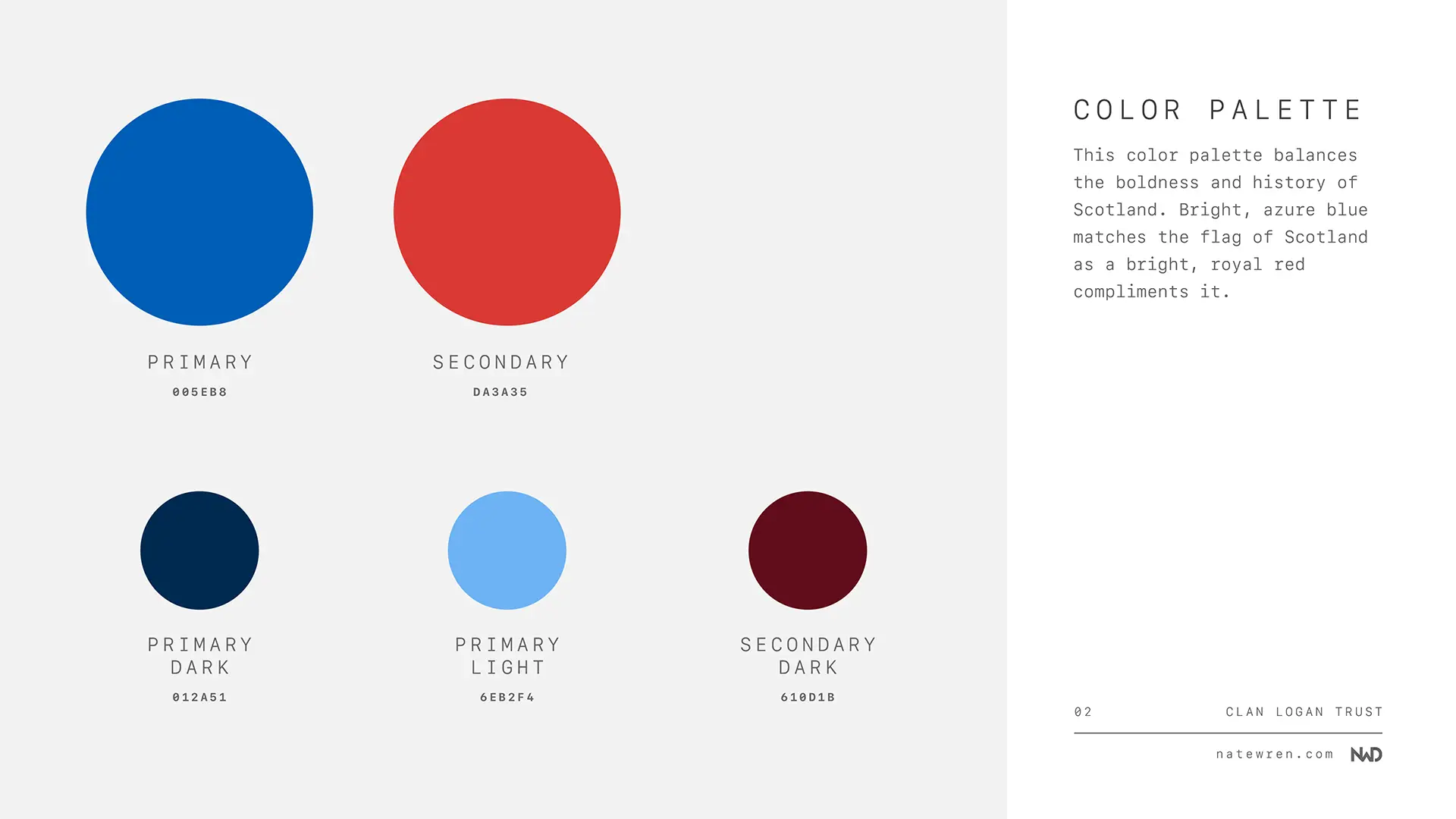
For a Scottish charity there was an obvious starting point. #005EB8 is the blue of the Saltire, the Scottish flag, and it does the heavy lifting across the whole identity. A deep navy at #012a51 handles headings and darker sections and gives the brand some gravity.
The accent is a heraldic red at #C8102E. It shows up on buttons, links, and highlights, and it is a nod to the reds that run through Scottish clan heraldry. Three colours, a few neutrals, and enough contrast to pass accessibility checks without anyone having to think about it.
Typography
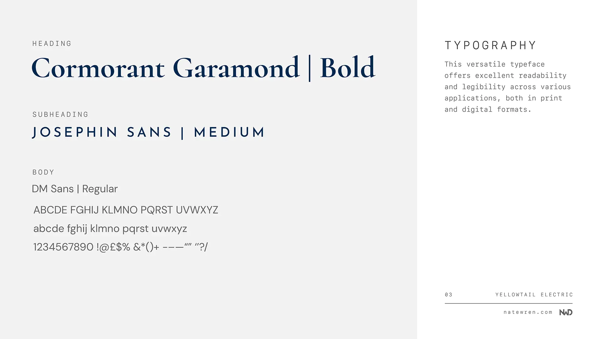
Headings are set in Cormorant Garamond. It is a serif with real character, and it suits a family whose recorded history reaches back to at least the 12th century. Body copy is DM Sans, which keeps long paragraphs of history and project detail comfortable to read on a phone.
The guide sets out the full scale, the weights to use where, and the pairing rules, so anyone making a poster or a newsletter for the trust can match the site without guessing.
Why a small charity needs a branding guide
A branding guide sounds like something only big organisations bother with. In practice it is more useful to a small one, because a small organisation has more people making things and fewer of them are designers.
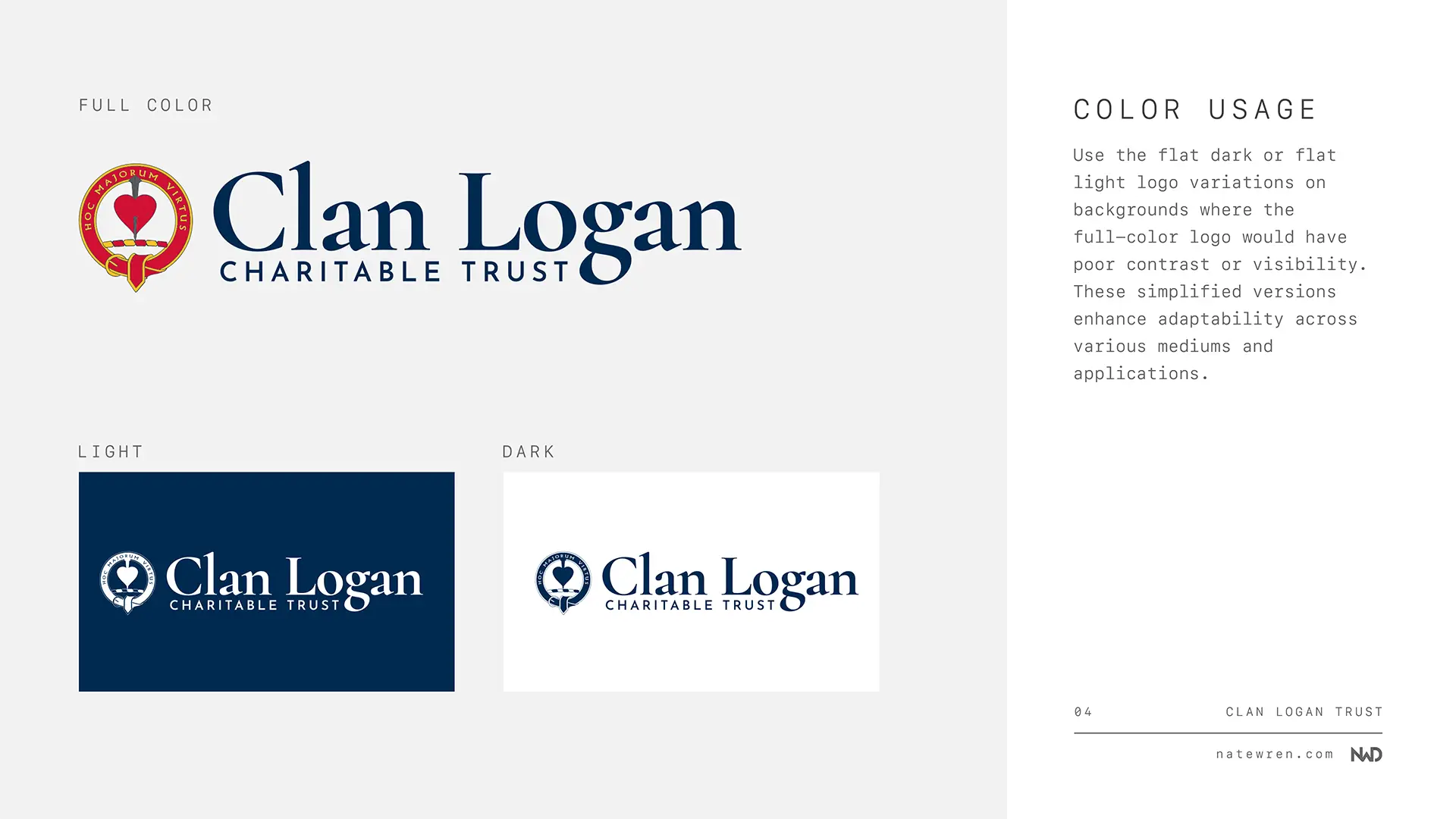
The trustees can now hand this PDF to a printer, an event organiser, or whoever is making the next newsletter and everything will match. They have the logo files in every format they need, the exact colour codes, the font names, and clear rules about spacing and what not to do to the crest. It also made building the website far quicker, because every design decision had already been made before I opened Bricks.
The brand in use
I built the trust’s website too, at clanlogantrust.co.uk, and having the branding finished first made the build much faster. You can see the site in the website portfolio piece, or read the full behind the scenes write up covering the brand, the build, and the custom Stripe donation system on the blog.
Looking to build a brand?
If you are starting something new, or you have a logo that has never quite had a system around it, I would like to hear about it. Reach out through my contact form for a no obligation chat about what a brand identity would look like for you.